Anda Ingin Mecari Uang di Internet, silakkan kunjungi salah satu link ini !!!
http://www.clixncash.com/index.php?ref=aciang_007
http://clixncash.com/ptp2.php?p=1&ref=aciang_007
http://clixncash.com/ptp2.php?p=2&ref=aciang_007
http://clixncash.com/ptp2.php?p=3&ref=aciang_007
http://clixncash.com/ptp2.php?p=r&ref=aciang_007
My Banner

Wednesday, May 23, 2007
Monday, May 7, 2007
Tutorials Adobe Photoshop
Cel Shading
I figure it’s time to start adding content of some kind to this site of mine, and why not start with a quick Photoshop tutorial? This is the first tutorial of any kind that I’ve done so if you want to drop me any feedback, please feel free to do so. You can e-mail via the webmaster link at the bottom of my site.
Overview
This tutorial is just going to walk through the steps of doing a quick and easy cel shading style that I recently picked up. The advantage of this style is that the shading and the flat colors are on separate layers, so screwing up something doesn’t mean the end of the world—it just means fixing a layer or two.
Most Cel Shading techniques rely on you choosing a shade color, or colors, or each flat color you use. This one will use a separate layer of a base shadow color, and then using the “Hard Light” blending mode will create a nice looking cel shaded effect. You control where the shade drops just by using a simple black and white mask on the shadow layer.
The final result from this tutorial is going to look something like this:

Actually it's going to look exactly like that. I’m going to go through all the steps, so lets start with just the initial sketch.
Part I
The first thing I do when starting any sort of drawing in Photoshop is fill the canvas with a color. Any color will do, but usually it’s a grey-ish color, so that I can see the lines better. I never sketch or color on a plain white background because it makes it difficult to judge color. Its also easier on the eyes not to draw on a bright white background.
So starting out with just a blue background, and a new layer set on multiply, I sketch out a real quick Kamie face.
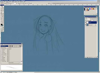
Notice how I have Photoshop's workspace set up. I never liked the default Photoshop set up so I use this custom work space. Also I have my own little set of brushes that I use for drawing. My “pencil” brush is just a normal round brush that’s usually 2 to 4 pixels wide with the opacity and flow controlled by the pen pressure. (I’m using a Wacom tablet, if you couldn’t tell.)
That’s pretty good for a sketch, so let’s move on and do a quick ink job. For inking I use a size 6 to 10 pixel brush, with the spacing set to around 40%, and the radius is controlled by the pen pressure. I’m also going to make a new layer for the inks, set that on multiply, and bump down the sketch’s opacity so I can see what I’m doing a little better.
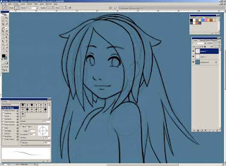
Remember that line variance is a key to getting a good looking inked drawing. Bigger objects need fat lines, and small details need smaller lines. Don’t just ink your drawing with a stiff radius; otherwise it becomes flat and boring.
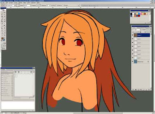
Now that I have an inked layer, I can throw some color underneath it. I like to use the color swatches palette in Photoshop because it’s easy to make a color set and keep track of the colors you’ve used. I already have some colors in my palette from another Kamie picture that I did, so I’m just going to back to those.
For dropping flat color, I use a separate layer for each color, and a thick brush with 100% hardness and pen pressure controlled width. I’m going to start by laying down the skin color, which I find is the best color to start out with.
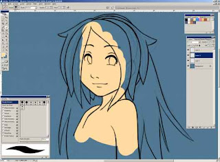
I don’t really have to be that accurate when it comes to laying down the skin color, especially under an area that I know is going to be covered later. The next step is going to be just throwing down the other colors for the hair and then a layer for the face details like the eyes.
There’s the final version of the flat color. I find it easier to use a separate layer for each color, especially when you’re actually applying the color. This comes in handy when I’m coloring in her blonde hair, because it is so close to the skin color it becomes hard to distinguish, so by hiding the skin layer when coloring her hair I can color the hair more accurately.
Part II
Man I didn’t think this would be this long. Oh well.
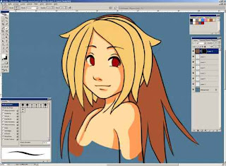
Now it’s time to do some simple shading. I figure I’m just going to drop a light source from the top left somewhere. I usually like to cast the light somewhere so that her face is directed to it. That usually portrays a light, happy mood. Lighting can really add a lot of feeling to a piece, but that will be for another tutorial.
Anyway, to get started on the shading I’m going to pick a darkish brown color and create a new layer filled with that color. I’m also going to take that layer, and set it’s blending mode to “Hard Light.” It may look a little strange, but that’s because you’re looking at the color as if it was 100% shaded.
Now I want to hide that entire layer I just made, and I’m going to do that by masking it. Click the mask button with the layer of hard light selected and fill the mask with black. If you didn’t know, masking is a really awesome technique in Photoshop to show or hide parts of an image without actually having to erase that part of an image. When you create a mask, you’re creating an image of black and white that will be linked with that layer. Areas of the mask that are filled with white will show through 100% to the final image, and areas of the mask that are filled with black will be hidden completely. So basically the idea is that we’re going to show the hard light layer by painting the mask white where we want the shadow to be.
With my light source at the top left I’m going to draw in the shadows by painting white onto the mask using a hard brush.
Hm… I can already tell that I’m not really liking the color the skin is while shading. It’s coming out too saturated. So, I can just fix that by choosing a new color and filling the layer with it. If you’re doing this, be sure you’re filling the layer with the new color, and not the mask. It’s probably easier to choose the shadow color with some of the picture shaded now anyway.
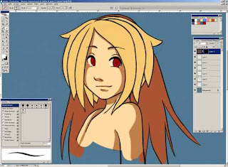
Yeah, I think I’m digging this color a lot more. It’s a little less saturated, and a little darker. So I did the skin, and now I’m just going to drop shadows on the rest of her just by painting white on the mask. Remember if you screw up its really easy to fix, you just have to paint black on the mask where you don’t want it to show up. Also, if you just have white and black selected as your colors in Photoshop, you can easily switch between them using the X key on your keyboard.

Well there she is, all cel shaded. But it still looks pretty boring, so now I’m going to throw some detail on. Using a hard brush, I’m going to add some white highlights on a new layer set to screen.
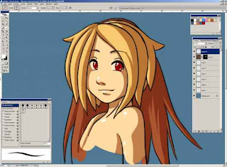
That’s a little better, but still not there. Next I’m going to add the super cliché hair highlights. I’m going to grab the color of her hair and use it on the screen layer to give her the highlights. Using pure white doesn’t really look that good to me.
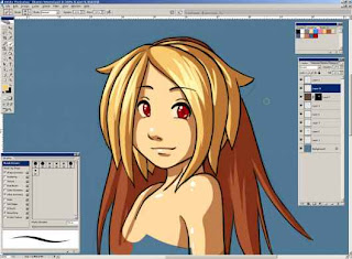
I also changed the layer order a little bit because I realized that I had the screen and hard light layers above the ink layer, which was a little screwy. It’s looking a little prettier, but it needs just a little bit more.
Part III
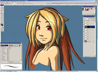
I’m going back to my Hard Light layer for this one. This is where that layer comes in handy the most I think. I’m going to be adding another color of shadow to the layer. If you don’t understand what I mean, then the picture will probably help.
I’m going to take a dark blue-ish color and actually paint it on the layer so that the deeper shadows are blue. This adds a lot of depth to the shadow and also gives the image a little more color variation to spice it up a little bit. Remember, for this I’m going to be drawing on the actual layer and NOT the mask.
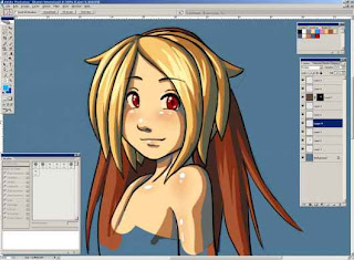
Now I think that looks pretty awesome. But I just realized that there is actually one detail that I forgot, and that’s adding some “blush” to her skin color. For that I’m just going to make a new layer over her skin, and set it to multiply. Then I’m going to take a brush with opacity and fill set to pen pressure, and paint a reddish orange over some parts of the skin.
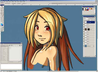
Before I’m done, I’m going to do another neat little trick and duplicate the ink layer. I’m going to take the layer I just duplicated, and just Gaussian blur it a little bit. Then, play with the opacity a little bit and I’m done, and ready to call this complete.
Conclusion
Heres the final result, zoomed out:

This is just a little doodle that I colored, so if you could imagine this applied to a more complicated drawing, it would probably look a lot better. By using a separate layer for all the colors, and the shading, I feel like I have a lot more control over the image, and mistakes are less costly and easily fixed.
That concludes my first tutorial ever, I hope everything turned out well. If you have any feed back you can drop me a line through that “webmaster” email link at the bottom of this page. Thanks for readin’!
I figure it’s time to start adding content of some kind to this site of mine, and why not start with a quick Photoshop tutorial? This is the first tutorial of any kind that I’ve done so if you want to drop me any feedback, please feel free to do so. You can e-mail via the webmaster link at the bottom of my site.
Overview
This tutorial is just going to walk through the steps of doing a quick and easy cel shading style that I recently picked up. The advantage of this style is that the shading and the flat colors are on separate layers, so screwing up something doesn’t mean the end of the world—it just means fixing a layer or two.
Most Cel Shading techniques rely on you choosing a shade color, or colors, or each flat color you use. This one will use a separate layer of a base shadow color, and then using the “Hard Light” blending mode will create a nice looking cel shaded effect. You control where the shade drops just by using a simple black and white mask on the shadow layer.
The final result from this tutorial is going to look something like this:

Actually it's going to look exactly like that. I’m going to go through all the steps, so lets start with just the initial sketch.
Part I
The first thing I do when starting any sort of drawing in Photoshop is fill the canvas with a color. Any color will do, but usually it’s a grey-ish color, so that I can see the lines better. I never sketch or color on a plain white background because it makes it difficult to judge color. Its also easier on the eyes not to draw on a bright white background.
So starting out with just a blue background, and a new layer set on multiply, I sketch out a real quick Kamie face.

Notice how I have Photoshop's workspace set up. I never liked the default Photoshop set up so I use this custom work space. Also I have my own little set of brushes that I use for drawing. My “pencil” brush is just a normal round brush that’s usually 2 to 4 pixels wide with the opacity and flow controlled by the pen pressure. (I’m using a Wacom tablet, if you couldn’t tell.)
That’s pretty good for a sketch, so let’s move on and do a quick ink job. For inking I use a size 6 to 10 pixel brush, with the spacing set to around 40%, and the radius is controlled by the pen pressure. I’m also going to make a new layer for the inks, set that on multiply, and bump down the sketch’s opacity so I can see what I’m doing a little better.

Remember that line variance is a key to getting a good looking inked drawing. Bigger objects need fat lines, and small details need smaller lines. Don’t just ink your drawing with a stiff radius; otherwise it becomes flat and boring.
Now that I have an inked layer, I can throw some color underneath it. I like to use the color swatches palette in Photoshop because it’s easy to make a color set and keep track of the colors you’ve used. I already have some colors in my palette from another Kamie picture that I did, so I’m just going to back to those.
For dropping flat color, I use a separate layer for each color, and a thick brush with 100% hardness and pen pressure controlled width. I’m going to start by laying down the skin color, which I find is the best color to start out with.

I don’t really have to be that accurate when it comes to laying down the skin color, especially under an area that I know is going to be covered later. The next step is going to be just throwing down the other colors for the hair and then a layer for the face details like the eyes.

There’s the final version of the flat color. I find it easier to use a separate layer for each color, especially when you’re actually applying the color. This comes in handy when I’m coloring in her blonde hair, because it is so close to the skin color it becomes hard to distinguish, so by hiding the skin layer when coloring her hair I can color the hair more accurately.
Part II
Man I didn’t think this would be this long. Oh well.
Now it’s time to do some simple shading. I figure I’m just going to drop a light source from the top left somewhere. I usually like to cast the light somewhere so that her face is directed to it. That usually portrays a light, happy mood. Lighting can really add a lot of feeling to a piece, but that will be for another tutorial.
Anyway, to get started on the shading I’m going to pick a darkish brown color and create a new layer filled with that color. I’m also going to take that layer, and set it’s blending mode to “Hard Light.” It may look a little strange, but that’s because you’re looking at the color as if it was 100% shaded.

Now I want to hide that entire layer I just made, and I’m going to do that by masking it. Click the mask button with the layer of hard light selected and fill the mask with black. If you didn’t know, masking is a really awesome technique in Photoshop to show or hide parts of an image without actually having to erase that part of an image. When you create a mask, you’re creating an image of black and white that will be linked with that layer. Areas of the mask that are filled with white will show through 100% to the final image, and areas of the mask that are filled with black will be hidden completely. So basically the idea is that we’re going to show the hard light layer by painting the mask white where we want the shadow to be.
With my light source at the top left I’m going to draw in the shadows by painting white onto the mask using a hard brush.

Hm… I can already tell that I’m not really liking the color the skin is while shading. It’s coming out too saturated. So, I can just fix that by choosing a new color and filling the layer with it. If you’re doing this, be sure you’re filling the layer with the new color, and not the mask. It’s probably easier to choose the shadow color with some of the picture shaded now anyway.

Yeah, I think I’m digging this color a lot more. It’s a little less saturated, and a little darker. So I did the skin, and now I’m just going to drop shadows on the rest of her just by painting white on the mask. Remember if you screw up its really easy to fix, you just have to paint black on the mask where you don’t want it to show up. Also, if you just have white and black selected as your colors in Photoshop, you can easily switch between them using the X key on your keyboard.

Well there she is, all cel shaded. But it still looks pretty boring, so now I’m going to throw some detail on. Using a hard brush, I’m going to add some white highlights on a new layer set to screen.

That’s a little better, but still not there. Next I’m going to add the super cliché hair highlights. I’m going to grab the color of her hair and use it on the screen layer to give her the highlights. Using pure white doesn’t really look that good to me.

I also changed the layer order a little bit because I realized that I had the screen and hard light layers above the ink layer, which was a little screwy. It’s looking a little prettier, but it needs just a little bit more.
Part III
I’m going back to my Hard Light layer for this one. This is where that layer comes in handy the most I think. I’m going to be adding another color of shadow to the layer. If you don’t understand what I mean, then the picture will probably help.
I’m going to take a dark blue-ish color and actually paint it on the layer so that the deeper shadows are blue. This adds a lot of depth to the shadow and also gives the image a little more color variation to spice it up a little bit. Remember, for this I’m going to be drawing on the actual layer and NOT the mask.

Now I think that looks pretty awesome. But I just realized that there is actually one detail that I forgot, and that’s adding some “blush” to her skin color. For that I’m just going to make a new layer over her skin, and set it to multiply. Then I’m going to take a brush with opacity and fill set to pen pressure, and paint a reddish orange over some parts of the skin.

Before I’m done, I’m going to do another neat little trick and duplicate the ink layer. I’m going to take the layer I just duplicated, and just Gaussian blur it a little bit. Then, play with the opacity a little bit and I’m done, and ready to call this complete.

Conclusion
Heres the final result, zoomed out:

This is just a little doodle that I colored, so if you could imagine this applied to a more complicated drawing, it would probably look a lot better. By using a separate layer for all the colors, and the shading, I feel like I have a lot more control over the image, and mistakes are less costly and easily fixed.
That concludes my first tutorial ever, I hope everything turned out well. If you have any feed back you can drop me a line through that “webmaster” email link at the bottom of this page. Thanks for readin’!
Arti Dari Mandiri
Sebuah kata bijak ku persembahkan bagi para pengunjung yang terhormat...
Sesungguhmya seseorang bisa
disebut mandiri bukan lantaran
ia sudah tidak lagi meminta,
tapi karena ia sudah bisa memberi
harapan akan kembali memberi.
Moga kata bijak nie berguna bagi kita semuaaa.....
dan kita menjadi tau apa arti Mandiri sesungguhnya....
CU.....
^_^..........
Sesungguhmya seseorang bisa
disebut mandiri bukan lantaran
ia sudah tidak lagi meminta,
tapi karena ia sudah bisa memberi
harapan akan kembali memberi.
Moga kata bijak nie berguna bagi kita semuaaa.....
dan kita menjadi tau apa arti Mandiri sesungguhnya....
CU.....
^_^..........

Subscribe to:
Posts (Atom)

